


With an ever-increasing demand for responsive website design (RWD) among businesses today, it’s more important now than ever before to make sure you have a thorough understanding of the techniques, frameworks, and tools available. Understanding why RWD is such an integral part of modern website development can help you both expand your knowledge and create attractive sites that are tailored to user preferences. In this blog post, we’ll be discussing the reasons behind the high demand for RWD in 2023 and revealing some key tips to get you started on creating effective websites with the basic principles of RWD. So let’s dive right into why you should prioritize using these techniques when developing your sites!
What is Responsive Web Design (RWD)?
A responsive web design (RWD) is a design approach that allows a website’s layout and content to adjust and adapt to various screen sizes, from a desktop computer to a tablet or mobile device. This means that no matter what device your audience is using, your website will look great and be functional. RWD also provides a better user experience and improves the website’s search engine rankings. In short, a responsive website design is a smart investment for anyone looking to reach a wider online audience.
Why is RWD Important for Businesses in Today’s Digital World
RWD allows websites to be easily accessible and navigable across all devices, including smartphones, tablets, and desktops. As more and more people use their mobile devices to browse the internet, businesses need to ensure that their website is optimized for the best user experience possible. By implementing RWD, businesses can improve their website’s visibility and accessibility, ultimately increasing their online presence and revenue. With RWD, businesses can stay ahead in the game and provide customers with a seamless and enjoyable browsing experience no matter where they are.
Advantages of RWD Techniques, Frameworks, and Tools
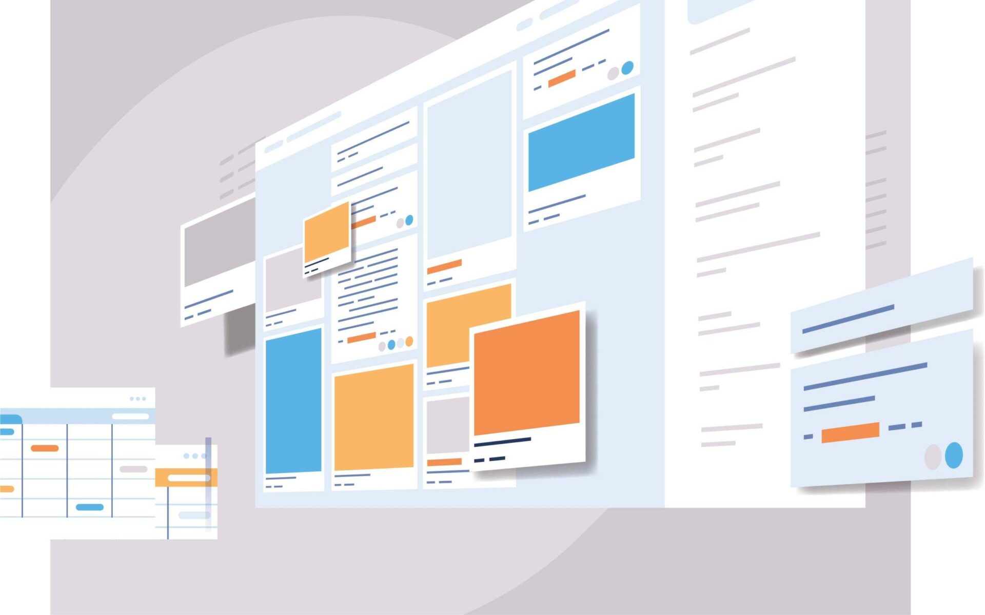
Responsive Web Design (RWD) techniques, frameworks, and tools have revolutionized the way websites are built and used. There are many advantages to using RWD that make it a popular choice for developers. With RWD, websites can be viewed on any device, eliminating the need for multiple websites targeted at different devices. This in turn saves developers time and money, while also providing a better user experience. RWD also allows for easier maintenance and updates, as changes made to the website only need to be made once to be reflected across all devices. Additionally, RWD techniques ensure that websites are optimized for search engines, making them more likely to appear in search results. Finally, the use of frameworks and tools further allows developers to easily create responsive designs, leading to even greater efficiency and effectiveness. Overall, RWD techniques, frameworks, and tools have greatly improved the web development process and are a valuable asset to any developer.
Common RWD Techniques
With the advancement of technology, developers use various techniques to build responsive website designs. Among these techniques, flexible grids, images, media queries, and breakpoints play a significant role in making a website responsive. Flexible grids allow the web layout to adjust according to the screen size, while images and media queries help optimize image size, layout, and content based on the device. Breakpoints, on the other hand, assist in determining the layout and style changes at specific screen sizes. When developing a responsive website, mastering these techniques is essential to create an exceptional user experience. Understanding and implementing these techniques require a detailed approach, but it’s worth the effort to ensure your website looks great on every device.
Popular RWD Frameworks, and Tools Available on the Market
Popular RWD frameworks like Bootstrap, Foundation, and Semantic UI have made designing and developing responsive websites easier than ever before. These frameworks boast a variety of tools and features, such as pre-built templates, responsive navigation, and user interface components. Bootstrap is a widely used framework, favored for its extensive documentation and flexibility. Foundation offers a more modular approach, with customizable components that allow for greater flexibility. Semantic UI, while newer than the other two, offers a more modern and streamlined design. With these frameworks and the abundance of tools available on the market, designing a responsive website has never been easier or more accessible.
a) Bootstrap
Bootstrap is a widely-used Responsive Website Design (RWD) framework that has gained a large following among web developers. One of the key features that make Bootstrap so popular is its ability to create responsive and mobile-friendly websites. It provides a user-friendly grid system that allows developers to easily customize layouts and design elements to create websites that look great on any device. Additionally, Bootstrap comes with robust CSS components and JavaScript plugins that make it easy to incorporate interactive elements, such as navigation menus and forms, into websites. Overall, Bootstrap is an excellent RWD framework that offers a great balance between functionality and ease of use.
b) Foundation
Foundation is a highly popular responsive web design (RWD) framework that is extensively used by web developers for creating stunning web applications. This open-source framework is loaded with a wide range of features that make it easy to create responsive designs in real time. From customizable UI components and semantic coding to compatibility with almost all major web browsers, Foundation is packed with features that simplify the process of building responsive websites. This framework also has an intuitive grid system that makes aligning content on a webpage a breeze. With all these features and more, it’s no wonder Foundation is one of the most widely used RWD frameworks in the industry!
c) Semantic UI
Semantic UI is a highly popular responsive web design (RWD) framework that has gained traction among developers due to its excellent features. This framework is an intuitive and comprehensive toolkit that offers robust CSS and SASS components, enabling developers to create high-quality, responsive websites with ease. The framework’s naming convention and syntax are very clear and concise, making it easy for developers to comprehend and remember the code. Additionally, Semantic UI’s collection of pre-designed themes allows developers to customize their site design and focus on functionality rather than aesthetic elements. Overall, Semantic UI is a highly effective RWD framework that triumphs due to its ease of use and adaptability.
How to Implement an Effective and Engaging RWD Strategy
Implementing an effective and engaging RWD strategy can be challenging. To begin, start by analyzing your website’s current traffic and functionality. This will help you determine which devices and screen sizes your audience is using the most. From there, it’s important to create a design that is visually appealing and easily navigable on all devices. Incorporating interactive elements, such as animations or videos, can also help enhance engagement and make your website stand out. Ensuring your website loads quickly and has clean code is also crucial in maintaining an effective RWD strategy. With these tips in mind, you’ll be on your way to creating a responsive website that engages with your audience and boosts your online presence.
Tips and Best Practices for Responsive Web Design (RWD)
First and foremost, make sure your website is flexible and fluid, meaning that it can adjust to different screen sizes. Additionally, use media queries to adjust the layout, font size, and images. And don’t forget about touch-friendly buttons and navigation. By following these tips and best practices, you’ll be well on your way to creating a website that’s optimized for all devices and user-friendly for all visitors.
Conclusion
In conclusion, responsive web design (RWD) is a must-have in today’s digitally-driven world. When businesses offer an optimized user experience regardless of device or platform, they stand the greatest chance of success. Adopting RWD techniques allows you to guarantee excellent customer service and boost loyalty from customers without having to use multiple sites for different devices. Popular RWD frameworks include Bootstrap, Foundation, and Semantic UI – each offering its own set of features for developers and designers to utilize. Regardless of which framework is used, businesses should ensure their websites are fully optimized with well-thought responses for each device type and screen size for optimum performance. Implementing an effective and engaging RWD strategy is paramount for any organization — from small startups to large enterprises — who want to stay on top in their industry. Follow these tips and best practices to make sure your website is able to keep up with the swiftly changing web trends while providing an appealing and reliable service!