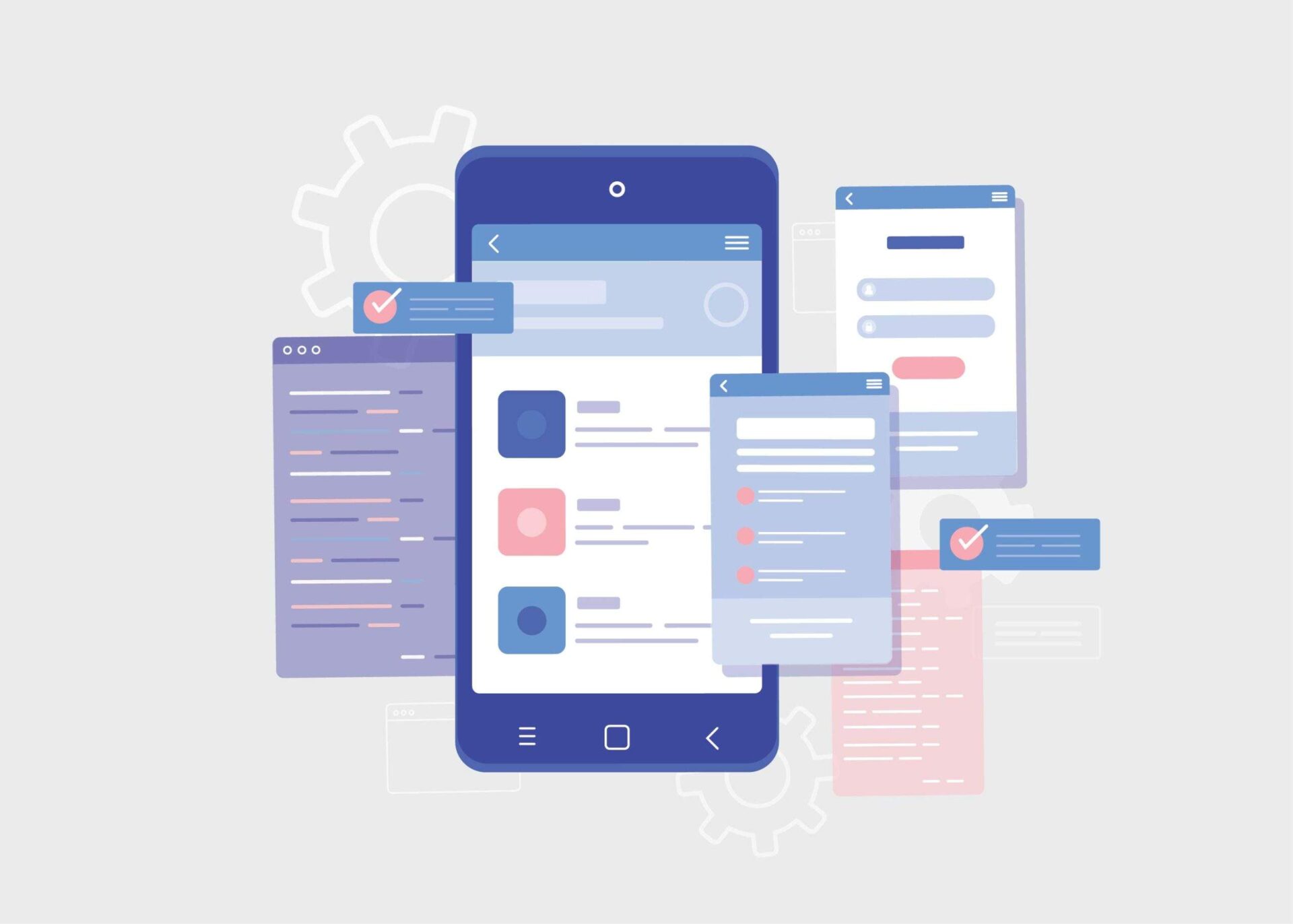
The minimalist design trend is becoming increasingly popular, especially among tech-savvy designers who aim to create user experiences that are easy to navigate, aesthetically pleasing, and effective. Minimalist UI/UX design delivers numerous advantages in terms of space management and usability for users; it also has a few drawbacks. In this blog post, we’ll explore how minimalism is transforming the way that businesses engage with their audiences, as well as its limitations when used on the web. We’ll look at examples of successful minimalist design implementations and discuss best practices for putting together your own designs that maximize results while mitigating potential pitfalls. Whether you’re just getting started with designing or an experienced veteran looking to hone your skills, read on to discover more about the benefits (and limitations) of minimalist web design!
What is Minimalist UI/UX Design and How Does it Relate to User Experience (UX)?
Minimalist UI/UX design focuses on simplifying user interfaces by removing unnecessary elements and emphasizing functionality. This approach follows the concept that “less is more” when it comes to UX design. By minimizing the clutter and prioritizing the most important features, the minimalist design enhances the user’s experience by making it easier for them to navigate and achieve their desired tasks. Adopting minimalist design principles can result in increased user satisfaction, engagement, and loyalty. In order to implement a successful minimalist UI/UX design, designers need to understand their target audience and carefully consider which elements are crucial to the user experience.
Benefits of Minimalist UI/UX Design
Minimalist UI/UX design has become increasingly popular in recent years due to its many benefits. With a minimalist design, clutter is reduced and functionality is prioritized. This not only creates a clean and visually appealing user interface but also makes it easier for users to navigate and find what they are looking for. A minimalist design also improves website speed and performance, which is essential for providing a seamless user experience. In addition, minimalist design allows for faster development and easier maintenance, making it a cost-effective option for businesses. Ultimately, a minimalist design prioritizes user needs and enhances the overall user experience, making it a valuable approach in today’s digital landscape.
-
Improved Usability
With the rise of minimalism in design, it’s easy to assume that usability might be sacrificed in the pursuit of a sleek and streamlined aesthetic. However, the truth is quite the opposite. Minimalism can actually enhance usability and make for a more intuitive user experience. By cutting down on visual clutter and unnecessary elements, users can more easily find what they need and focus on the task at hand. Plus, a simple and elegant design can be visually appealing and even calming to use. The key is to strike the right balance between minimalism and functionality, ensuring that the design remains user-friendly and not just fashionable. With this in mind, designers can create interfaces that are both beautiful and easy to use.
-
Enhanced Focus on Mobile-Friendly Features
To truly succeed in today’s fast-paced digital environment, it’s crucial to enhance the focus on mobile-friendly features. This means ensuring that the design is not only aesthetically pleasing and easy to navigate but also optimized for a seamless mobile experience. From intuitive touch controls to responsive layouts, a focus on mobile-friendly design features can provide users with a streamlined experience that keeps them engaged and satisfied.
-
Fewer Distractions for Users
A minimalist design can make a world of difference when it comes to user experience. By reducing distractions, users can focus on the essential aspects of the interface they are interacting with. A cluttered design could make it arduous for users to understand what action they should take next. On the other hand, a clean and straightforward approach to design can improve the experience and ease the user’s journey toward their goal. Fewer distractions can also mean a reduced cognitive load, allowing users to process the information effectively and without confusion. A minimalist design approach ensures that your website or application fits the user’s needs while providing them with a seamless experience.
Limitations of Minimalist UI/UX Design
Minimalist UI/UX design may have its praises, but it certainly has limitations. While the lack of clutter and sleek aesthetics may seem pleasing to the eye, it can also limit the amount of information that can be conveyed to the user. Important details might get lost in the sea of white space or overshadowed by the design itself. Another limitation of minimalist design is its tendency towards impersonality. While simplicity is key, attempting to create a completely streamlined experience can take away the human touch that many users crave. Ultimately, while there is value in minimalist design, it’s important to remember that it may not always be the best approach for every project.
-
Limited Customization Options
Minimalist design is all about simplicity and a clean, uncluttered look. While this design approach is visually appealing and can lead to a sleek, modern aesthetic, it can also limit the customization options available to users. With fewer design elements to work with, designers may feel constrained in their ability to create something truly unique. However, this limitation can also lead to a greater focus on the essential elements of design, resulting in a design that is both functional and visually appealing. In the end, the choice of a minimalist design should be based on the specific needs and goals of the project, and whether the trade-offs in customization are worth the benefits of a more streamlined approach.
-
Difficulty Accommodating Complex Interactions
Minimalist design has become increasingly popular in recent years for its clean, simplistic aesthetic. However, as sleek as it may appear, minimalist design can present challenges when dealing with more complex interactions. Accommodating these interactions can be difficult without compromising the overall minimalist feel. Finding a balance between functionality and design can be a daunting task. Nonetheless, designers are up for the challenge and are constantly exploring new ways to incorporate complex interactions into minimalist design without compromising the user experience. The goal is to create a design that not only looks great but also functions seamlessly. So, while a minimalist design may present challenges when it comes to complex interactions, it also presents an opportunity for creativity and innovation.
Tips for Overcoming the Limitations of Minimalist UI/UX Design
Minimalist UI/UX design has become increasingly popular among designers as it provides a clean and simple interface that focuses on the functionality of the product rather than the design. However, despite the benefits it offers, a minimalist approach also presents some limitations. To overcome these limitations, a UI/UX design agency needs to find ways to balance simplicity and functionality. One tip is to incorporate subtle and tasteful animations, which can add an extra level of engagement without sacrificing the minimalist aesthetic. Another tip is to use typography to create visual interest and hierarchy, providing users with a clear understanding of the content and information displayed. With these tips, designers can overcome the limitations of minimalist UI/UX design and deliver a functional and visually appealing product.
-
Leverage Contextual Aids & Visual Cues to Help Guide Users
While minimalist designs may appear sleek and straightforward, designers often face the challenge of helping users navigate through content without overwhelming them. That’s where contextual aids and visual cues come into play. These elements provide subtle guidance to users and can make all the difference in their experience. By utilizing context-specific information and imagery, designers can help users understand the purpose and functionality of features without the need for lengthy instructions or repetitive design elements. The end result is a harmonious balance between simplicity and usability, enabling users to effortlessly achieve their goals within the minimalist design.
-
Use Progressive Disclosure to Simplify Complex Interactions
Simplifying complex interactions in minimalist designs can be a daunting task, but with the help of progressive disclosure, it becomes much easier. This design technique involves breaking down information into smaller, more manageable chunks that reveal themselves gradually as the user interacts with the interface. By limiting the initial display of information to only what is necessary and progressively revealing more as needed, designers can reduce clutter, streamline the user experience, and enhance the overall usability of the interface. Through using this technique, designers can create minimalist designs that not only look sleek and modern but also provide users with the information they need in a clear and digestible manner.
When Is Minimalism Not the Best Choice for Your Website Design
Minimalism has been a popular trend in website design for years. However, just because something is trendy doesn’t mean it’s always the best choice for your website. There are times when minimalism can actually be detrimental to the user experience. For example, if your website is an e-commerce site, you may need to provide users with multiple images and detailed information about your products. In this case, a minimalist design may not be suited to showcase your products or give visitors enough information to make informed purchasing decisions. Likewise, if your website is for a creative agency or portfolio, a minimalist design may not be the best way to show off your work and attract clients. Ultimately, the design of your website should be dictated by the purpose of your site and the needs of your audience.
Examples of Successful Minimalist UI/UX Designs
Minimalist UI/UX designs are all about simplicity and efficiency. They are a great way to create a user-friendly interface without overwhelming your users with too much information. That’s why it’s important to take inspiration from successful minimalist designs. For example, take a look at Dropbox or Google’s search page. Both are clean, simple, and easy to use. The purpose of minimalist UI/UX designs is to focus on the content, rather than the design. That’s why typography, whitespace, and color are so important in these designs. They should all work together seamlessly to create a finished product that is both beautiful and functional. Whether you’re designing a website or mobile app, be sure to keep these principles in mind when creating your own minimalist UI/UX design.
Conclusion
In conclusion, minimalist UI/UX design is a great choice to elevate user experience and engage users. Although it does have its limitations, following tips such as leveraging contextual aids and visual cues and using progressive disclosure, can help you work around them. Ultimately though, minimalism may not be the right choice for every web design project. By studying successful minimalist UI/UX designs, and taking notes of common elements that make up these designs, you can decide whether this is the right direction to take your own project in. Thoughtfully considering minimalism when looking toward how you can best create an enjoyable user experience will always serve you well.

