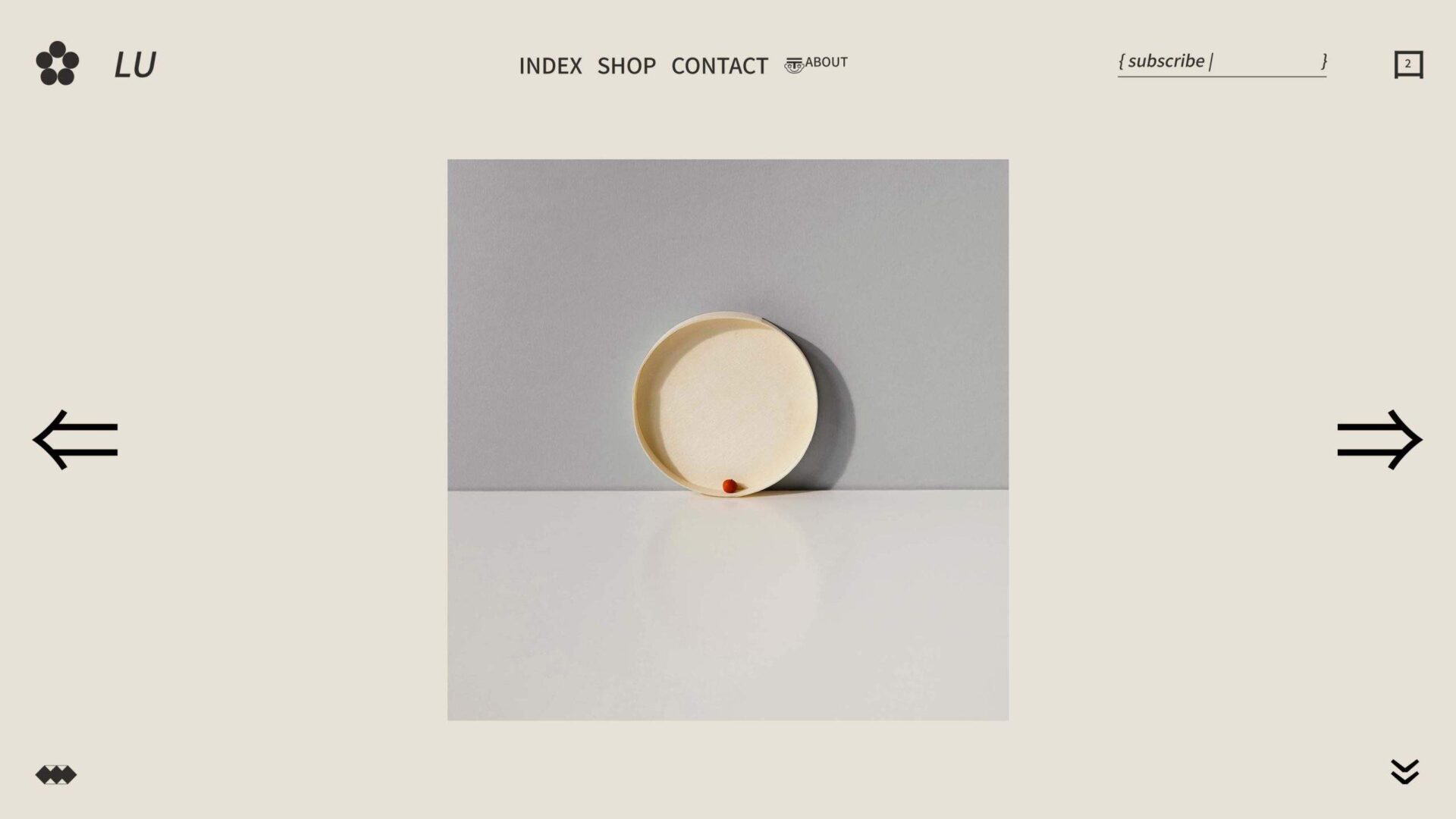
Minimalism has become a popular trend in recent years, influencing everything from home design to how we consume media. But minimalism may be even more impactful for businesses – where simple designs can make all the difference in standing out among their competitors and connecting with customers. In this blog post, we’ll look at how minimalist design helps differentiate brands and why it’s worth considering when launching your business or revamping an existing visual identity. From the benefits of clean lines to increasing recognizability, find out why minimalist web design is becoming a go-to choice for entrepreneurs worldwide!
The Benefits of Going Minimalist
In a world where there seems to be an endless stream of information and distractions, going minimalist has become a popular trend. Unsurprisingly, brands are now opting for a clean, simple design that avoids unnecessary clutter. Not only does it make their products or services easier to understand and navigate, but it also allows for a more focused and memorable brand image. Minimalist designs can evoke a sense of sophistication and elegance, attracting a more discerning and upscale consumer. So if you’re a brand looking to stand out in a crowded market, consider going minimalist for a fresh, modern approach that will captivate your audience.
Elements to Include in Your Brand’s Minimalist Strategy
Minimalism is a popular design choice among brands looking for a clean and modern aesthetic. However, it’s not just about stripping away excess design elements. To create a successful minimalist strategy, brands need to include key elements that will make their brand recognizable and memorable. This includes a distinct color palette, a unique typography style, and a simple yet striking logo. Brands should also focus on the user experience, making sure that their website and other marketing materials are easy to navigate and user-friendly. By incorporating these essential elements into a minimalist design strategy, brands can achieve a visually appealing and cohesive brand identity that resonates with their target audience.
Re-evaluating Your Brand’s Color Palette
Your brand’s color palette is integral to establishing your identity, making it crucial to periodically re-evaluate and refresh it to ensure continued relevance and effectiveness. Choosing a minimalist color scheme for your brand can be a bold move, but one that can pay off in spades. By embracing simplicity, you open yourself up to a whole new world of brand possibilities that can set you apart from the competition. To apply a minimalist approach to your color palette, start by narrowing it down to a select few colors that embody your brand’s personality and messaging. Incorporate these colors strategically throughout all aspects of your brand, including your website design. With a minimalist color palette, the focus will be on the quality of your content and the strong impression your brand leaves on visitors.
Simplifying Your Logo Design
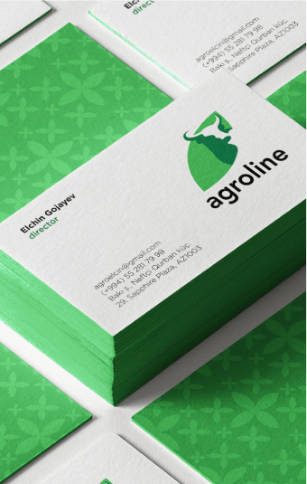
Simplicity has become imperative for most businesses and when it comes to creating a logo, it’s no different. A simple logo can make a strong impact, while a complicated one can become a challenge to remember. Moreover, designing minimalist logos also conveys a sense of elegance and sophistication, depicting your company as modern and efficient. With the right combination of elements, a minimalist logo can give your brand a unique identity, capturing your audience’s attention. Keep in mind that creating a minimalistic logo doesn’t mean that it has to be boring or uninteresting. It’s all about finding the right balance of design elements to communicate your brand’s values and message effectively. Keep reading to find out how you can create a simple yet compelling logo that represents your business.
Prioritize Content
When it comes to designing a minimalistic website, less is certainly more. However, this can pose a challenge when it comes to prioritizing and showcasing the most important content. After all, you want to ensure that visitors to your website understand your brand’s message without compromising its sleek and modern aesthetic. Fortunately, by taking a strategic approach to your content, you can strike the perfect balance between form and function. Whether it’s placing your value proposition front and center or incorporating subtle design elements that draw the eye to key information, there are plenty of ways to make sure your website does its job while looking great doing it.
Utilizing Typography
Beautiful typography can truly elevate the look and feel of your brand. When it comes to choosing fonts, it’s important to look beyond the basic fonts that everyone is using. Opt for unique fonts that match the personality and style of your brand. A carefully chosen font can convey your brand’s values and message in an instant and can be an effective way to stand out from the competition. With so many options available, take the time to choose a font that is not only visually appealing but also reflects the heart and soul of your brand. By utilizing typography in this way, you can create a cohesive and recognizable brand identity that will make a lasting impact on your audience.
Optimizing Your Website Design
Creating an engaging user experience on your website is crucial to attract and retain customers and one effective approach is adopting a minimalist design, which not only improves visual appeal but also enhances functionality. A minimalist design is all about stripping down unnecessary elements and focusing on the core components that effectively communicate your message. However, designing a minimalist website can be challenging, especially if you lack the necessary technical skills and expertise. That’s where a web design agency comes in. With their experienced team and cutting-edge tools, they can help you optimize your website design, delivering a remarkable user experience and ultimately boosting your business success.
Examples of Brands with Minimalist Design
Minimalism is a design philosophy that has been embraced by many brands, and there are numerous success stories to back it up. One of these brands that stand out is Apple. The tech giant has been a pioneer in clean, simple, and elegant design since its inception. Its website reflects this philosophy, with a minimalist interface that’s easy to navigate. Another brand that has embraced minimalism is Google. The search engine giant’s website is uncluttered, with a focus on typography, whitespace, and ease of use. Airbnb is another brand that has succeeded with minimalism. Its website is a testament to the power of simplicity, with a clear hierarchy and minimal distractions. These examples show that minimalist websites can be elegant, effective, and engaging.
Conclusion
Minimalism is a powerful tool for brands. Its impact often extends beyond aesthetics and influences the way a brand interacts with customers. With the right strategy, a minimalist approach allows brands to create simple yet effective visuals that will capture their audience’s attention. The key is to make sure the design of your elements ‐ from colors and fonts to logos and typography ‐ is intentional. When implemented into your branding and website design, these components enhance experiences and drive engagement. By assessing current practices and making necessary adjustments, you can ensure your brand’s success by taking a minimalist approach. Ultimately, there are countless advantages to creating a visually stimulating online presence using minimalistic standards – it elevates your identity in a unique way no one else in the market can replicate quite like you can. If done correctly, it will leave a lasting impression on users that they won’t be able to forget!

