


It’s undeniable – we’re living in a mobile age. Smartphones help us stay connected, entertained, and up-to-date on news, entertainment, and much more. That’s why it’s essential for any modern website or web application to be a custom web design with an eye toward the increasingly dominant mobile device market. One solution that many designers have turned to is a responsive web design, which focuses on minimizing the number of page elements necessary while maximizing usability across various devices and platforms. In this blog post, we’ll discuss some of the key concepts behind responsive design as well as how minimalism can play an important part in developing effective solutions for today’s users who are always connected with their mobile phones close by.
What is Responsive Design and Why Does it Matter in the Mobile Age
In today’s mobile age, having a website that is easily accessible on multiple devices is more important than ever. This is where responsive design comes into play. Responsive design is a method of web design that allows websites to adapt to different screen sizes and resolutions without sacrificing functionality or user experience. It ensures that your website looks and works just as well on a smartphone as it does on a desktop computer. With the majority of internet users now accessing the web from mobile devices, having a responsive website is not just a luxury, it’s a necessity. Without it, you could be missing out on a significant portion of your potential audience. So, if you want to stay ahead of the curve in the digital age, responsive design is a must-have for your website.
Minimalism as the Key to Effective Responsive Design
Minimalism is more than just a trendy design movement. It’s a powerful tool that can enhance the effectiveness of responsive design. By stripping away unnecessary elements, minimalism can help to simplify the user experience and improve website loading times. In a world where consumers expect quick and easy access to information, this is crucial. Not only does minimalism improve functionality, but it also creates a stronger brand identity by highlighting key elements of a website’s design. Embracing minimalism can be difficult, but it’s definitely worth considering for those seeking to optimize their website’s usability and overall design.
Four Principles of Responsive Design to Follow
In today’s digital age, having a website that’s mobile-friendly is more important than ever before. That’s why it’s crucial to follow the four principles of responsive design.
- Firstly, ensure that your website has a flexible and fluid layout that can adapt to different screen sizes.
- Secondly, use high-quality images that load quickly regardless of the device being used.
- Thirdly, choose legible fonts that are easy to read on small screens.
- Lastly, make sure that your website is easy to navigate regardless of whether it’s being accessed on a phone or desktop.
By following these principles, you can create a website that not only looks great but also provides a positive user experience for all visitors.
Strategies for Optimizing Content for Mobile Devices
As more and more people rely on their mobile devices for online browsing, it’s becoming increasingly important for businesses to optimize their websites for these smaller screens. But how can you ensure that your web content is efficiently translated onto a mobile device? One key strategy is to simplify your design. Get rid of any clutter that might distract from your message, and consider ways to streamline your text and images. You’ll also want to make sure your site loads quickly and smoothly, so users aren’t stuck waiting for your content to appear. Ultimately, the goal is to create a seamless user experience that makes browsing your website a pleasure, rather than a chore. With these strategies in mind, you can take your web content to the next level and reach a wider audience than ever before.
Benefits of a Responsive Website for Your Brand
A responsive website is one that is designed to adapt to various screen sizes, from desktop computers to mobile phones. Not only does this provide a better user experience for consumers, but it also has numerous benefits for your brand including increased visibility, improved search engine rankings, and stronger brand recognition. With more people using their mobile devices to access the internet, having a website that is optimized for these smaller screens is crucial to staying competitive in today’s market. By investing in a responsive website, you can ensure that your brand is reaching as many potential customers as possible and delivering the best possible online experience.
Tools and Resources For Creating A Responsive Site
Having a responsive website is essential for any business. But creating such a site can be a daunting task if you don’t have the right tools and resources. Luckily, there are plenty of options out there to help you create a dynamic and responsive website. From website builders like WordPress and Wix to frameworks like Bootstrap and Foundation, there are many ways to get started with responsive web design. Additionally, there are a variety of online resources, tutorials, and communities where you can learn from experts and get support as you build your site. With the right tools and resources at your fingertips, you can create a website that is optimized for any device, ensuring that your customers can easily access your content no matter where they are.
How to Optimize Your Site for SEO with Minimalist Design
Your website’s design plays a crucial role in determining your search engine ranking. Search engine optimization (SEO) must be an integral part of your website design strategy to help boost your website’s visibility. A minimalist design is a popular trend in web design and is a perfect way to optimize your site for SEO purposes. Minimalism in web design means having fewer elements on a webpage, reducing clutter and unnecessary distractions, and providing a better user experience. Simple, clean designs with white space and clear navigation menus can improve your site’s ranking and make your site more accessible to your audience. With a minimalist design, your website can rank higher, load faster, and offer a better user experience.
Why Responsive Design Tends to be More Usable on Mobile Devices
Mobile devices have become an essential part of our daily lives, and with that, the importance of responsive design has also risen significantly. The reason why responsive design tends to be more usable on mobile devices is quite simple – it adapts to the size and orientation of the device. With responsive design, there’s no need to zoom in or pinch to view content on a smaller screen. The layout adjusts automatically to fit the screen size, making it easier to navigate and access information. This approach provides a seamless user experience across all devices, and it’s no surprise that it’s become an essential part of web design in today’s mobile-first world.
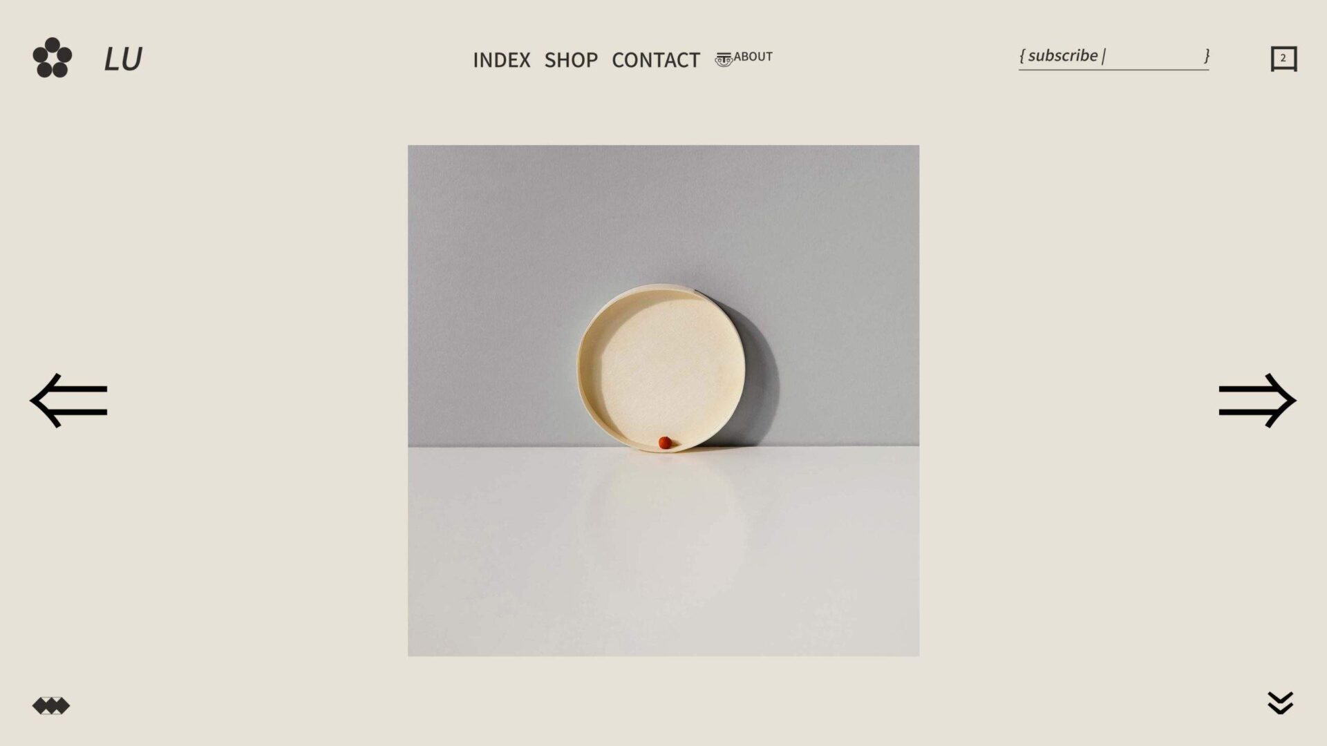
Examples of Successful Minimalist Web Designs
Minimalism is all the rage these days, and it’s not difficult to see why. Nothing beats the clean, sophisticated vibe of a website with a minimalistic design. If you’re looking for inspiration, here are a few exemplary minimalist websites that are sure to impress. First up, we have Dropbox’s website, which features a simple and elegant design with a bright blue header that’s hard to miss. Next, take a look at Airbnb’s website, with its white background and bold font that draws the user’s attention to important features of the site. Finally, there’s Medium’s website, which boasts a clean and crisp design with plenty of white space. All of these minimalist websites have one thing in common: they convey the message with simplicity, yet with all the necessary design elements in place.
Conclusion
It is undeniable that mobile technology has revolutionized the way businesses and consumers interact, making it essential for any business or online presence to have a mobile strategy. Responsive design, with its emphasis on simplicity and minimalism, may just be the key to meeting this challenge. By following the four pillars of responsive design, using tools and resources designed specifically for creating a responsive site, and leveraging optimized content for mobile devices, your brand can gain tremendous benefits from a successful mobile experience. As seen in many examples of minimalist website designs, creating a beautifully simple user experience with responsive design has never been easier. With all the advancements of today’s technology, it is advisable to take advantage of cutting-edge approaches such as responsive design in order to stay competitive in today’s mobile age.