


Creating a logo or user experience that stands out from the rest can be tricky business. You want your design to pop, but you don’t want it to look tacky – so how do you get it just right? Making sure to avoid common mistakes is one way of making sure you hit the mark with your target audience. If you’re looking for tips on what not to do when designing logos and UI/UX experiences, then this blog post is for you! Find out the biggest designer disasters around – and importantly how they can be avoided. Read on now to discover the top must-nots in logo and UI/UX design – helping ensure smooth sailing as your project progress.
Impact of Design Mistakes on Client Satisfaction.
Design mistakes can have a significant impact on client satisfaction. In the world of graphic design, logo design is often the first aspect that clients review. A poorly designed logo can create a negative impression, which affects a client’s perception of a business. Similarly, UI/UX design plays a crucial role in the client’s experience with a website or mobile application. A poorly designed user interface can lead to confusion, frustration, and ultimately dissatisfaction with the product. Therefore, designers need to pay close attention to the details while creating their designs to ensure that their mistakes do not negatively affect their client’s satisfaction.
Mistake 1: Lack of Clear Communication
Effective communication plays a vital role in any successful project, especially when it comes to logos and UI/UX design. Lack of clear communication can result in misunderstandings and faulty design outcomes that do not align with the client’s vision. A design team, when working on a project, needs to establish a clear line of communication to ensure the designer’s understanding of the client’s vision and goals. Clear communication with clients about objectives, target audience, and expected outcomes can help avoid misinterpretations and lead to efficient design. Effective communication is a cornerstone for the successful implementation of any visual design project.
Mistake 2: Ignoring User Experience (UX) Principles
Designing a website is not all about aesthetics; it is also about user experience (UX). Failing to pay attention to UX principles can lead to a frustrating experience for visitors, and may even discourage them from returning. Have you ever visited a website with confusing navigation that left you searching for hours? Or, have you encountered a cluttered layout that made it impossible to find what you were looking for? Unfortunately, these are all too common mistakes that people make when designing websites. Adding to that, there is also the issue of a lack of responsiveness on certain devices. It is essential to avoid these pitfalls and to prioritize the user when creating a website, and perhaps even consult with an expert in the field. After all, an aesthetically pleasing website is only enjoyable if it is easy to navigate and responsive for all users.
Mistake 3: Neglecting Consistency and Branding
In today’s fast-paced digital world, consistency and branding are essential for any business to succeed. However, neglecting these two crucial elements can be a costly mistake. Consistency in messaging and visuals is what sets a brand apart from its competitors and creates a sense of trust and reliability for customers. Neglecting branding can lead to a lack of recognition and a decrease in customer loyalty. It’s important for designers to clearly understand the brand identity and maintain consistency across all platforms, from social media to advertising.
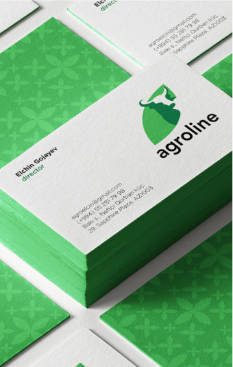
Examples
If a company’s logo is not consistently applied, it can lose its recognition value and create a negative impact on consumer perception. Inconsistency can confuse and damage a company’s reputation. Thus, it is crucial to follow a design style guide and implement a standard set of design practices to maintain brand identity consistency.
Mistake 4: Overcomplicating Design
Design is an art, but it is not a chance to showcase every idea in your head. Mistake 4, overcomplicating design, is a common pitfall, especially when trying to create an unforgettable computer interface. Whether designing for a website or app, the goal is always to keep users engaged and satisfied. Overloading the UI/UX design with excessive elements or complicated layouts will only lead to the opposite effect. Instead, focus on a simple yet engaging design that emphasizes the message you want to convey. A great logo can go a long way in supporting a clear and concise message. Clean and minimalistic design is the key to ensuring that users are not burdened or confused. So, let go of the temptation to add too much, and trust that less is truly more.
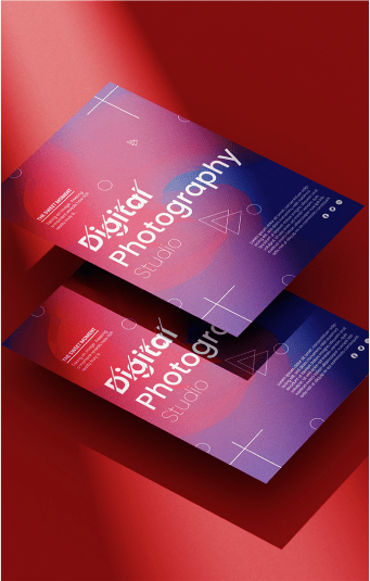
Simplification Techniques to Improve Clarity and Effectiveness
A well-designed logo and user interface (UI) can leave a lasting impression on users and enhance their overall experience. However, to make a design truly effective, it must also be clear and easy to understand. That’s where simplification techniques come in. By eliminating clutter, reducing complexity, and focusing on the most essential elements, designers can create designs that communicate their message more clearly and effectively. Whether it’s simplifying the layout of a UI or streamlining the elements of a logo, incorporating these techniques can make a significant difference in the success of your design.
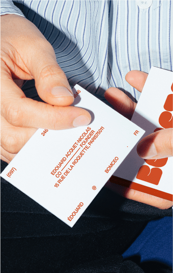
Mistake 5: Poor Typography Choices
Typography is a crucial element to consider when creating anything that involves text, from websites to business cards. Unfortunately, it’s all too easy to make mistakes with typography that can detract from the professionalism and clarity of your materials. Some of the most common typography mistakes include using fonts that are difficult to read, failing to space your text properly, and being inconsistent with your use of typography styles. These errors can have a significant impact on how your design is perceived by others. By being mindful of your typography choices and avoiding these common mistakes, you can ensure that your design communicates effectively and accurately every time.
Mistake 6: Lack of Attention to Accessibility
It’s important to create products and experiences that are accessible to everyone. Unfortunately, many make the mistake of not paying enough attention to accessibility, which can result in frustrating experiences for users with disabilities. One common mistake is insufficient color contrast. This can be a major problem for those with visual impairments, making it difficult to read or navigate. Another mistake is the lack of alternative text, which is important for those using assistive technologies like screen readers. And let’s not forget about inaccessible navigation, which prevents users from easily moving around a website or app. By avoiding these common accessibility mistakes, you’ll not only create a more inclusive experience for all users, but you’ll also show your commitment to creating products that everyone can use.
Design Mistake 7: Failing to Iterate and Seek Feedback
Designing a logo or working on UI/UX design can be an arduous task, and a lot of effort goes into getting it right. The last thing you want is to launch a product that lacks functionality and usability. It’s not just about aesthetics; a well-designed product should have feedback from end-users incorporated into it. Failing to iterate and seek feedback can lead to missed opportunities and faults that could have been avoided. Making changes based on constructive feedback is critical for an excellent final product. To neglect it is to risk leaving behind a trail of disgruntled users who will not hesitate to abandon your brand. Therefore, it’s essential to incorporate improvements and seek feedback to avoid this design mistake.
Conclusion
It’s important for designers to be mindful of the mistakes that can be made during the design process to ensure they are providing an effective and positive experience for clients. By making sure that communication is clear, user experience principles are respected, consistency and branding are maintained, designs are not overcomplicated, typography choices are correct, accessibility standards are met, feedback is taken into consideration, and modifications are made where needed, designers can create beautiful results that correspond with their clients’ specific needs. Ultimately, avoiding these design mistakes allows designers to foster better relations with their clients while increasing customer satisfaction in the long run.