


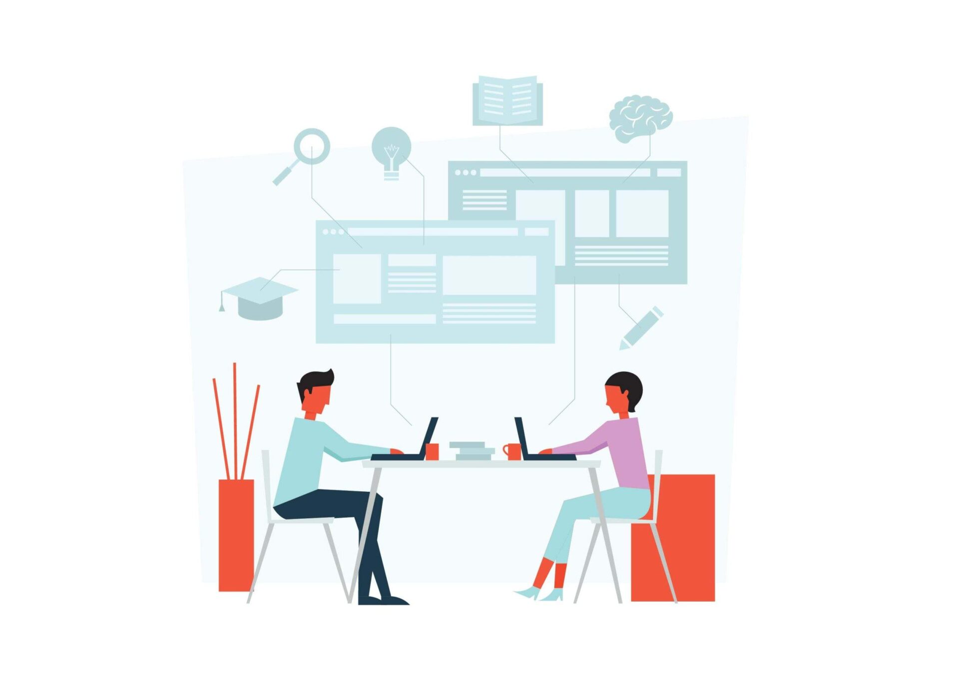
As every website owner knows, a basic design won’t cut it in today’s increasingly competitive online arena. It’s critical to ensure that your site is aesthetically pleasing and can be scaled and adapted to changing market needs. Fortunately, with the rise of minimalist web design and modern techniques such as responsive web design, building a scalable and adaptable website doesn’t have to require extensive time or energy. In this blog post, we’ll take an in-depth look at how optimizing for scalability from the outset can help you create websites that are both beautiful and effective – no matter what direction technology takes over the coming years. So read on for tips on achieving elegant simplicity through scalability!
Benefits of Minimal Web Design
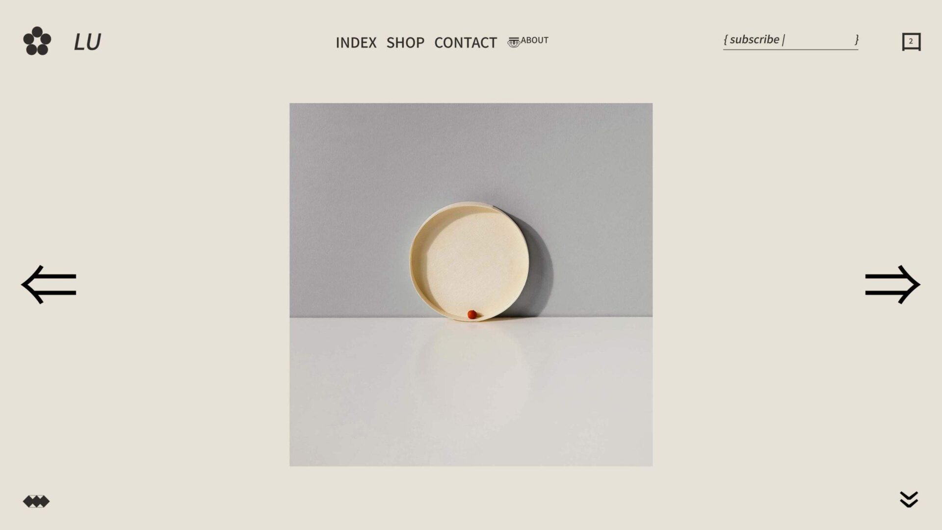
Minimal web design is an increasingly popular approach to website layout and design. When executed correctly, the benefits are clear. By stripping away excess elements, a minimalist design creates a sleek and seamless user experience, allowing the content to take center stage. It also makes navigation more accessible and faster, allowing users to easily find what they are looking for without being distracted by flashing graphics or overwhelming colors. Minimalism also provides a cleaner and more professional look, which can help to establish trust with visitors and potential customers. But perhaps the best advantage of a minimal design is that it loads faster, ensuring that visitors don’t have to wait and that the page is more likely to be ranked higher by search engines. All in all, minimal web design is simple but powerful and can undoubtedly improve the overall effectiveness of your website.
The Benefits of a Scalable & Adaptable Website
In today’s rapidly evolving digital landscape, having a scalable and adaptable website has become a necessity for businesses to stay competitive. A website that can expand or contract based on changing needs and can easily take on new functionalities without requiring a complete overhaul is a valuable asset. Such a website not only saves money and time but also enables businesses to keep up with the latest technologies and trends easily. Furthermore, a scalable and adaptable website enhances the user experience, as it can adjust to different devices and screen sizes, making it easier for visitors to navigate and interact with the site. The benefits of such a website are numerous and far-reaching, making it a smart investment for any business looking to succeed in the digital world.
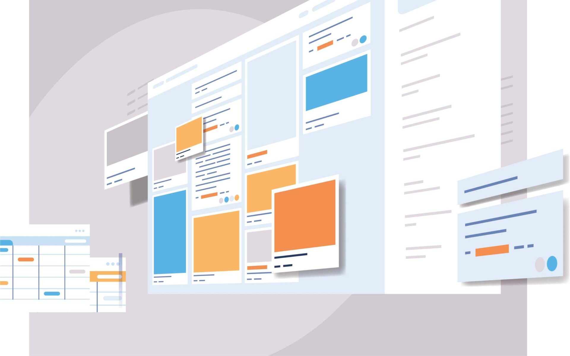
Scalable Graphics and Coding Techniques
Utilizing scalable graphics and coding techniques is an easy way to streamline your website and make it more professional-looking, improving your users’ experience. With the ever-increasing demand for fast-loading sites, optimizing images and coding can go a long way in enhancing your website’s appeal. Providing an enjoyable and seamless user experience has become crucial in attracting and retaining visitors, especially on mobile devices. If you’re looking to give your site that extra edge, consider incorporating scalable graphics and coding techniques that can help your website run faster and smoother than ever before. Or you can just get expert services from a web design agency and they’ll get you hooked!
Develop Responsive Navigation for Different Platforms
With the majority of people accessing the internet through their mobile devices, businesses must develop responsive navigation that adjusts to different platforms. This means exploring different design techniques that cater to the needs of users, regardless of the device they are using. A website that is adaptable to different platforms not only enhances the user’s experience but also improves the website’s visibility and search engine ranking. As such, it’s important to prioritize responsive navigation when creating a website. By ensuring that your website is accessible and user-friendly on all devices, you can attract more visitors, improve engagement, and achieve your business goals.
Consider Adaptability with Changing User Needs & Trends
As technology advances, so do the needs and trends of users. This means that your website must have the flexibility to adapt and evolve alongside them. Ensuring the adaptability of your website means considering numerous factors, including changes in user behavior, updates in search engine algorithms, and advancements in web design. By continuously assessing and refining your website’s features, content, and functionality, you can stay ahead of the curve and provide users with an exceptional browsing experience, no matter how their needs and trends change over time. Don’t let an outdated website hold you back – invest in adaptability and keep pace with the ever-evolving digital landscape.
Implement Search Engine Optimization
Simply having a website is not enough for your business. You need to make sure that potential customers can find it. This is where Search Engine Optimization (SEO) comes in. By implementing SEO techniques, you can improve your website’s ranking on search engines like Google. This means that when someone searches for a product or service that your business offers, your website will appear higher in the search results. By increasing your website’s visibility through SEO, you can drive more traffic to your site and ultimately increase your business’s revenue. Don’t let your website get lost in the vastness of the internet. Implement SEO techniques and watch your website soar to the top of the search results.
Ensure Accessibility with ARIA attributes
Making a website accessible for all users can seem like a daunting task, but with the help of ARIA attributes, it’s easier than you might think! ARIA, or “Accessible Rich Internet Applications”, is a set of attributes that can be added to HTML code to help make web content more accessible for users with disabilities. By adding these attributes, you can ensure that your website is compatible with a range of assistive technologies, such as screen readers, that help users interact with your content. Whether you’re building a new website from scratch or updating an existing one, using ARIA attributes is a critical step towards ensuring that all of your users, regardless of their abilities, can access your content with ease.
Leveraging Browser-Based Automation as a Time-Saving Tool
Leveraging browser-based automation can be a great time-saving tool to achieve this goal. By automating repetitive tasks, such as form submissions and page scrolling, you can free up valuable time to focus on other aspects of your website. Additionally, automation ensures consistency across your website and reduces the possibility of human error. With a faster and more efficient website, you can provide a better user experience for your customers, increasing their engagement and ultimately, your bottom line. So why not take advantage of browser-based automation and give your website the boost it needs to succeed in an increasingly competitive online marketplace?
Employ Reusable Components & Modular Architecture
Creating a website that is visually appealing, responsive, and user-friendly can be challenging, but there are ways to make the process smoother. Employing reusable components and modular architecture is a great way to keep things organized and efficient. By breaking down the website into reusable components, you can easily create a consistent design and make updates quickly. Modular architecture allows you to build a website in a way that is easy to modify and scale. Utilizing these techniques will not only save you time and energy but also result in a better user experience. With reusable components and modular architecture, you can create a website that is both visually stunning and easy to navigate.
Conclusion
Creating a minimal, scalable, and adaptable design for your website offers many long-term benefits. Not only does it make the user experience more enjoyable, but it also allows you to quickly adjust to changing needs and trends. Additionally, by utilizing SEO tactics and embracing accessibility standards, you’re providing an inviting online presence for all users. By leveraging cross-platform compatibility for multiple devices, as well as taking advantage of browser-based automation, you can ensure your website is always up to date with the latest design trends. Finally, creating reusable components and modular architecture will help keep your website organized while streamlining maintenance in the long run. While there’s a lot that goes into designing a successful website, focusing on these key principles is the first step in building a site that looks great and works like a dream.