When it comes to the look and feel of your website, making the right choice between minimalism and complexity can be daunting. After all, your professional web presence is an essential tool when it comes to engaging with potential clients, so it’s important for your site to have an aesthetic appeal that resonates with its audience. To help you make a decision on what type of design best fits your brand’s personality and needs, let’s explore why minimalism and complexity provide different advantages during the web design process plus how they serve different user experiences. With this blog post in hand, you will be well prepared to choose a style that meets both your vision as well as end values of users who interact on your site.
Understanding the Impact of Web Design on Your Brand
Your brand is more than just a logo or a slogan. It’s the sum total of all the impressions people have of your company. And in today’s digital age, much of that impression comes from your website. That’s why understanding the impact of web design on your brand is so important. A well-designed website can help build trust and credibility with your audience, while a poor one can drive them away. Beyond that, your website’s design can communicate a lot about your company’s personality, values, and style. So take some time to evaluate your site’s design and think about how it’s contributing to your overall brand identity.
Benefits of Minimalism in Web Design
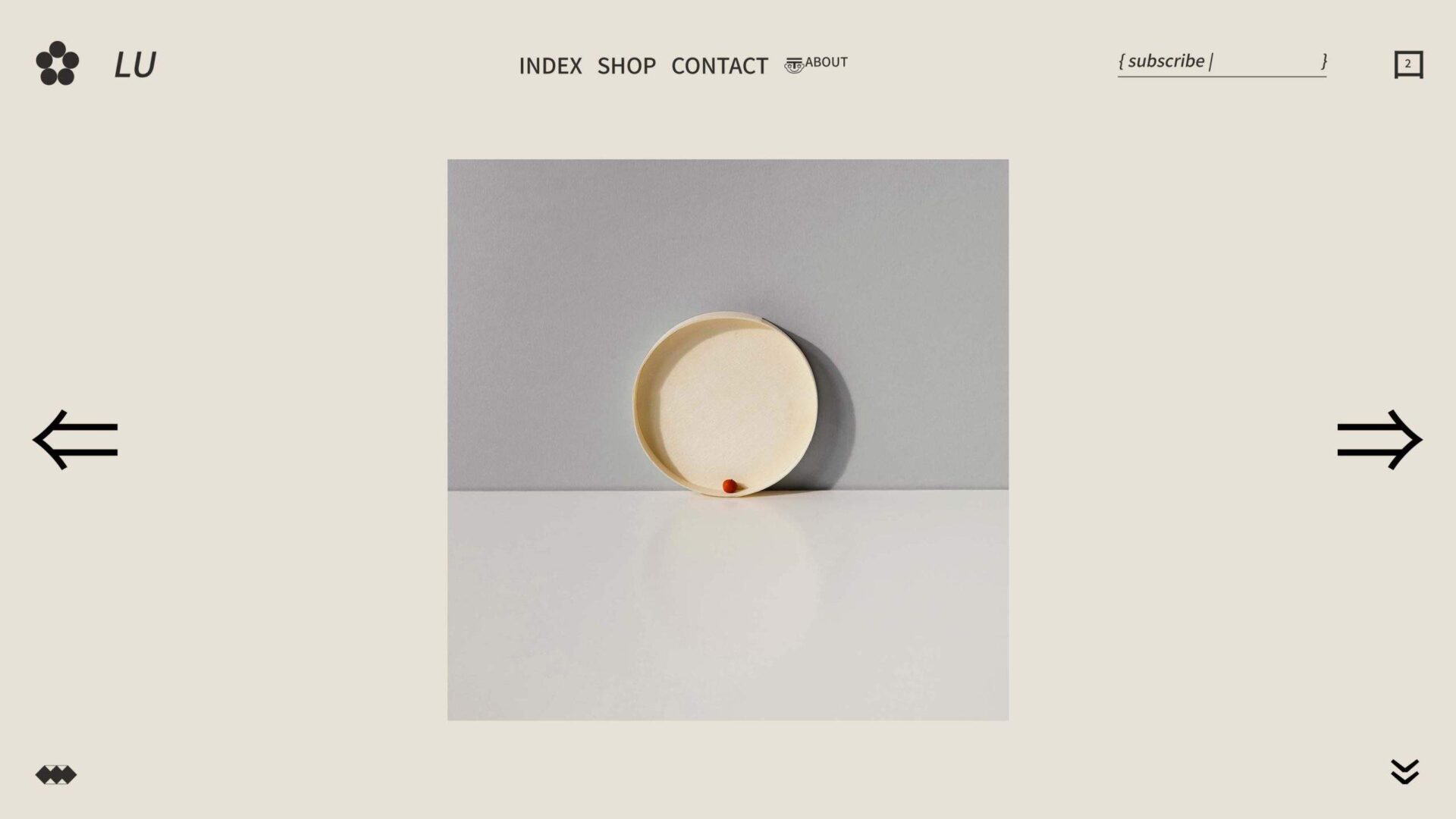
Minimalism in web design has become a popular trend due to its many benefits. By stripping away unnecessary elements, a minimalist design can improve the user experience by increasing the focus on the most important content. Not only is it visually appealing, but it can also improve the loading speed of a website and make it easier to navigate. With more and more people accessing websites on their mobile devices, minimalism can also make a site more mobile-friendly. In addition, a minimalist design can help a website stand out from the cluttered landscape of the internet. So if you want to make a lasting impression on your visitors, minimalism may be the way to go.
Drawbacks of Complexity in Web Design
Web design has come a long way since its inception. Today’s websites boast visually stunning graphics, unparalleled functionality, and seamless user experiences. However, with all the advancements comes a downside – complexity. The fashion for complex designs has its drawbacks, including longer loading times, higher costs, and greater susceptibility to malfunctions. While complexity can enhance a website’s appeal, the drawbacks shouldn’t be overlooked. It’s essential to strike a balance between an aesthetically pleasing design and practical functionality. As a brand, you must consider the costs and benefits of complexity to provide the best possible experience for our users.
Determine the Balance Between Minimalist and Complex Design
Creating a brand is not an easy task. It requires time, effort, and a vision for the future. However, equally important is understanding the needs of your brand and determining the perfect balance between minimalist and complex design. By assessing the needs of your brand, you can identify the factors that make it unique and communicate them effectively to your audience. In doing so, the importance of designing a simple but memorable logo, selecting a color palette that accurately represents your brand, and creating a consistent design across all marketing materials cannot be overstated. At the same time, it is essential to avoid cluttering designs with too much detail, as it can distract or confuse potential customers. Once you have balanced the minimalist and complexity of your brand’s design, you can create a lasting impact on your customers. It is this careful balance that will set your brand apart from your competitors and help it flourish in the market.
Advantages and Disadvantages of Minimalism and Complexity for Creating a Successful Website
In creating a website, one of the main considerations is its design. Often, developers struggle with whether they should go for a minimal or complex look and feel. Minimalism is an approach where designers strip down everything that doesn’t serve a purpose, resulting in a simple but elegant design. On the other hand, complexity entails using intricate designs and features to create an engaging user experience. Minimalism has the advantage of creating a clean and uncluttered interface that allows visitors to focus on the content. It also loads faster and is easier to navigate. However, it might lack the visual appeal needed to catch the visitor’s attention. Complexity has the advantage of being visually engaging, creating an immersive experience that visitors would love. It also allows for more creativity, which is essential in e-commerce and other sectors. However, it could lead to slower loading speeds, confusion, and higher costs for maintenance and upkeep. Therefore, developers should carefully consider the strengths and weaknesses of the two approaches before settling on one.
Type of Content that Requires Minimalism or Complexity in Web Design
Web design is a crucial aspect of creating a successful website. One important decision web designers must make is whether to utilize minimalism or complexity in the design of their website’s content. Certain types of content require minimalism, such as blogs, news articles, and product descriptions. These types of content benefit from a simple, yet sleek design that allows the reader to focus on the text and its message without any distractions. On the other hand, more complex content, such as interactive applications, data visualizations, or e-commerce sites, often require a more intricate design that can effectively communicate the information and provide an enjoyable user experience. Knowing when to implement minimalism versus complexity in design is key to creating a website that effectively delivers its content to the intended audience.
Key Tips on Choosing the Right Type of Web Design
Creating a website can be daunting, especially when it comes to choosing the right type of web design. Your website should reflect your brand’s style and personality, while also being easy to navigate and visually appealing. One important tip is to keep it simple. Minimalistic designs are not only popular but also efficient in highlighting important content. Another tip is to consider your target audience. What will appeal to them? Lastly, stay up-to-date with the latest design trends and continuously update your website. By keeping these tips in mind, you can choose the right type of web design for your brand and make a lasting impression on your audience.
Examples of Brands That Successfully Incorporated Minimalism and Complexity into Their Web Designs
In today’s digital age, having a visually appealing website is crucial in attracting and retaining customers. Brands that have successfully incorporated both minimalism and complexity into their web designs stand out from the rest. Take Apple, for example. Their website features a clean and simple design, with elegant typography and white space. However, they also incorporate complex interactive elements, such as product demonstrations and 360-degree views. Another brand that nails this balance is Dropbox. Their website uses a subtle color scheme and minimal graphics, while still providing ample information and functionality for users to navigate easily. By combining minimalist aesthetics with complex features, these brands have created websites that not only look great but also function efficiently.
Tips on Combining Minimalism & Complexity on a Single Site
When it comes to website design, it’s all about finding the right balance between minimalism and complexity. Using a minimalist approach can make a site visually clean and easy to navigate while incorporating complex elements that can add depth and interest. So, how do you combine both on a single site? First, focus on the user experience and prioritize functionality over decoration. Next, choose a cohesive color palette and typography that complements your brand. Incorporate white space to give the design room to breathe and use contrasting elements to draw the eye to important information. Lastly, experiment with animation and parallax effects to add movement and dimension to your design. With these tips, you can create a website that is both sleek and dynamic, while still serving its purpose in the most efficient way possible.
Conclusion
Ultimately, when it comes to choosing a web design for a brand, balance is key. It’s important to consider the advantages and disadvantages of minimalism or complexity in the context of your brand’s content and objectives – are you highlighting products/services more? Providing informational services? Aiming to amplify your storytelling capabilities? There’s no one-size-fits-all answer, but what has been consistently proven effective is finding a balance between minimalist and complex designs that allow when creating and delivering engaging experiences to end users. By evaluating the usefulness of either approach – or both — brands can be sure to unlock all their potential while still ensuring that their target audience has an enjoyable user experience. With these tips in mind, web designers will have a better understanding of how to use minimalism or complexity – or both – to elevate their brand’s website substantially.

